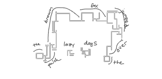
Snakescript
A devised, coded writing system
Introduction
I juggle most of my thoughts on a whiteboard or on sticky-notes. I don’t consider myself a particularly private person (and most probably don’t) but I’m pressed with the fact that anything I wouldn't exactly want to advertise to every passerby is...somewhat advertised. A pretty reasonable solution here would be to invest in a locked cabinet, but I read a lot of spy books as a kid, so I use codes.
For a lot of my adult life, I’ve used a weird mixture of Russian and Russian-transliterated English:
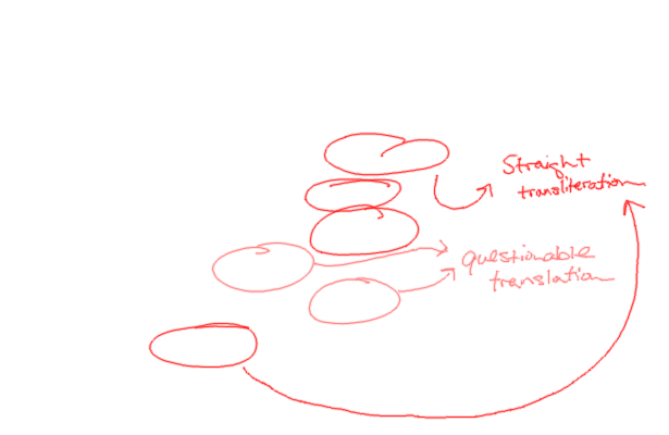
It more-or-less works. I’ve being doing it for long enough that reading is almost as fast as English and I’m rarely ever confused about the words I’d meant to write but because I’m not fluent, it degrades into transliteration pretty often. I would guess that, on average, about half of the notes I keep this way are intelligible to a person who’s memorized the Russian alphabet and all of them are perfectly understood by those fluent in both English and Russian.
Borrowing as code the writing system of a foreign language — especially one so widely-spoken — is a bad choice. Here, I play wishful linguist and invent a new one instead. (But, shh!) So that this post will have a title, I'll give it a silly name: Snakescript.
A New Writing System
Although the system should itself be invented, it’s important to contextualize it within others’ work.

Substitution ciphers, like Caesar and Pigpen, aren’t really suited for the task. That each letter and word is individually discernible makes it identical to a cryptogram, which is trivially reversed with a big enough corpus. Constructed languages, on the other end, are too involved. We don’t need to invent words or a fancy grammar — we can use the English ones. Somewhere in the middle, though, is deciding on a basket of cryptic-looking symbols and giving each a sound.
We also need some design goals. Inevitably, there will be tradeoffs. Should it be optimized to be written quickly? Read quickly? Easy to learn? Pretty? For my use, obscurity is a priority. To make it a little more interesting, I’d also like it to emulate a quality of an actual writing system:

Arabic calligraphy is still practiced as an art. It lends itself well to design because it has a very fluid ligature and packs very neatly. Brands use this to form contained shapes that can be, themselves, read. Here, Al Jazeera’s logo looks like either a drop of water or a cut of the Arabian Peninsula. TMG Holding, a property development company, casts long skyscraper-looking lines atop a very square foundation.
With careful attention to the written script, I’d also like mine to tessellate nicely.
Phonology
Before choosing actual shapes, we need to choose the set of sounds that they should be assigned to. We want to conceal the relationship between a letter and its sound as we do with the word it belongs to. As a first tradeoff, I opt for a phonetic spelling system. Each symbol should correspond to a sound in the English language, as opposed to a letter.

Wikipedia assigns 33 of the 107 International Phonetic Alphabet’s distinct sounds to English. I choose to model only Northern American English and not all of those are common enough to keep around. Since each distinct sound needs its own symbol and each symbol needs memorization and interpretation, I examine each individually and remove any that aren’t necessary to distinguish any words.
Consonants
Here are all 27 consonants, written out with examples and using a key I thought was intuitive.
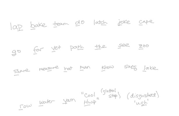
The example for 'K' starts with a 'c' because it's the sound we're interested in and both letters can make it. There are two 'TH's because one is voiced. 'ZH' and 'NG' look foreign but they're sounds we have, even if not with dedicated letters. 'HW' is a forced, breathy 'h' sound they start words with in the South and the glottal stop is the throaty cutoff that's usually heard instead of a true t-t-tee at the end of a word whose last letter is a 't'.
I get rid of six:
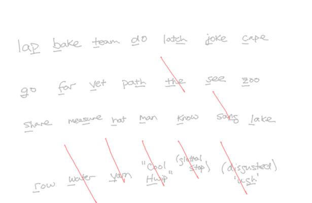
- Voiced ‘th’ (
ð, TH’) . It’s spelled the same as unvoiced ‘th’ (θ, TH) and sounds close enough. - Glottal stop (
ʔ). In reading, 't' should be recognized like any other consonant. - Velar fricative (
x, GH). Absent from U.S. English. Scots and Welsh folk should add it back. - Velar nasal (
ŋ, NG). Can be written out like all other consonant clusters: 'n', 'g'. - Voiceless ‘w’ (
ʍ, HW). Absent from Nothern U.S. English. Southern friends can add it back. - ‘W’ and ‘Y’. We can use vowel combinations instead (e.g. “wet” = “oo-eh-t”).
We can further cut down on symbols by reusing them between sounds that are related. Hangul uses similar signs for consonants that differ in voicing and has only one for both ‘R’ and ‘L’. Korean doesn’t have the ‘F’, ‘V’, ‘Z’, ‘SH’ or ‘ZH’ sounds but we can apply the same pattern here, too:
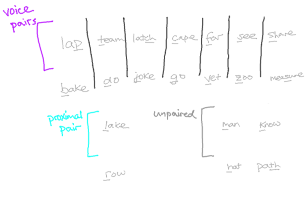
With six sounds removed and a seven more paired, the 27 consonants we started with now need only 12 symbols.
Vowels
IPA vowels are depicted along two major axes: the vertical height and longitudinal position of the tongue with pronunciation. Below, each of the 13 single-syllable words corresponds to the vowel sound at its position on the graph. Imagine swallowing the graph from the corner in the bottom right and try reading along the axes, paying attention to the position of the tongue.
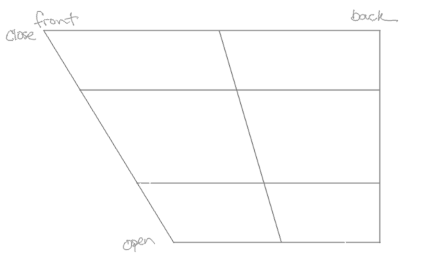
That the graph makes this problem geometric helps but the problem is still tricker than with consonants. It’s too difficult to identify the true sound of a vowel from the spelling of a word (consider: “boo”, “book”, “blood”) to intuitively say which ones are necessary.
It’s also difficult to determine whether, in cutting a vowel out, we’ve made any words unpronounceable. We could measure that ambiguity pretty exactly by inventorying the phonetic spellings of all the English words (or, say, the X most-frequent), replacing in those spellings the approximants we’ve chosen and then counting the number of words that would then be pronounced the same as some other. The body, though, would need to be huge in order to be representative. This approach is a little too involved for what we need.
We can do almost as well by examining edge cases: given a consonant word-shape and some vowel placeholder, how many distinct words can be formed? Using an English regular-expression dictionary, I pick out a few examples:
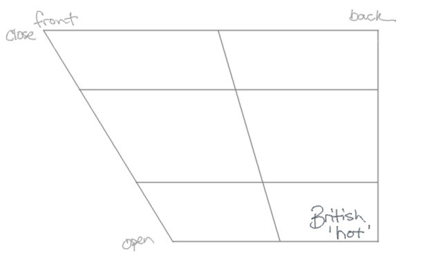
^h[aeiouy]{1,5}t.?$)The sparse set of words having the shape H_____T gives us some idea of what representation we need. For example, 'hut' seems pretty inclusive of all the sounds around it. We probably can group all of those together. No big surprises, though.
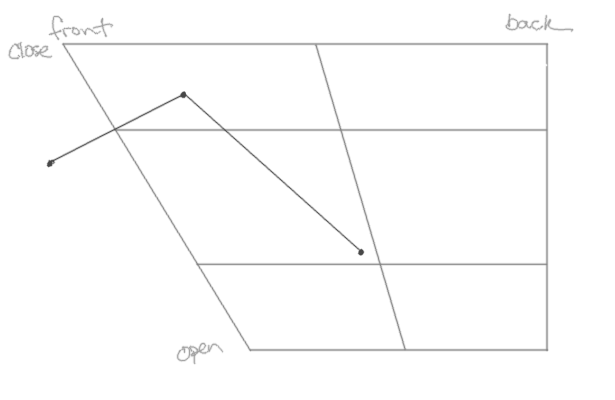
^l[aeiouy]{1,5}[ck][aeiouy]?$For L____K, we first notice that 'leak' and 'leek', phonetically, are the same — they're homophones. Without discarding any vowels, we've already introduced some ambiguity! Since we're already committed to phonetics, it gives us an error boundary: our system should be about-as-good as spoken English.
We also notice that 'like' is a combination of two sounds, threading through the ones in "but" and "lick" (hue). This is called a diphthong (huehue). We might be able to use this technique to further approximate the sounds we need by representating them as (approximate) combinations.
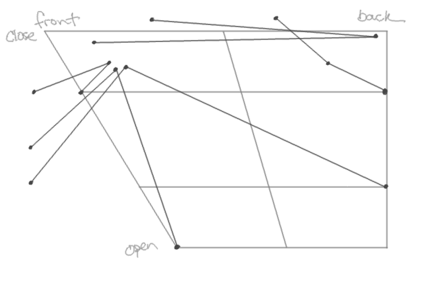
^m[aeiouy]{1,5}l.?$)This one's a little crazier.
First, all of the diphthongs running through the ɪ ('mill') cluster make it super-dense. We can take that as a hint to keep it. ɛ ('get') will probably be popular, too.
Second, the j in the ju combo in 'mule' is actually the consonant Y. Remember how above I struck out 'W' and 'Y' in favor of vowels? We definitely need to keep both u ('you') and i ('she').
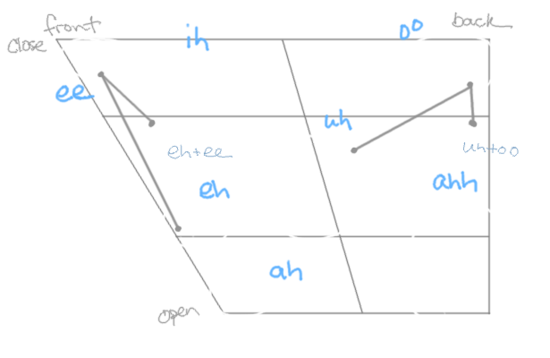
Continuing with this, I arrive at a set of seven:
- Group
ʌ,ə, andɜ(the middle cluster) (-2 sounds). - Group
ɑandʌ('talk' and 'part') (-1 sound). - Group
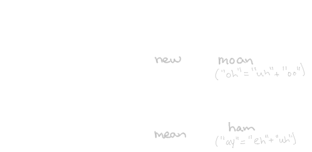
ʊandu('good' and 'you', -1) (-1 sound). - Represent long 'a' and 'o' sounds as
eɪ('uh'-'ee') andəu('uh'-'oo') (-2 sounds).
Now that our alphabet is nice and lean, how do we write it?
Script

Cursive writing moves in just one direction, so its letters need only begin and end at the same height in order to keep pen movement fluid. The tessellating quality I'm looking for is a little harder to satisfy. We need to pay attention to the geometry of the individual letters.
First, the shapes need to be characteristically simple enough to be arbitrarily stretched and sheared (you know, for art). Rounded shapes are more difficult to reason about and we can probably derive a more cursive form later, so we'll keep everything flat for now.
Second, in order to be able to shape them into blocks, words need to be able to grow in more than one direction. That direction doesn't need to be constant throughout but it needs to be easily discernible. Otherwise you won't know, in a jumbled mess, the flow of the word and the order of the letters. To make the decision easy, I'll say that perpendicularity should thread letters together. That means that each letter needs at two least sites to grow the next letter from perpendicularly, that are themselves perpendicular to one another. Another obvious consequence, too, is that no letter can have perpendicular elements.
Another concern is writing speed. Just as obviously, fewer strokes means faster writing. Here are the simplest shapes I can think of that satisfy these traits so far:

On the right, the perpendicular connecting sites are shown with a grey dot connecting the two letters. Choosing right and down as natural directions, the combination of any two letters can happen in either. We don't want to give up just yet the continuity of words, so in order to be able to "curl" a word back up and fill its negative space, we also need to be able to grow upwards and to the left as well. We can do this by reserving two more mutually-perpendicular "null" letters — ones that have no meaning by themselves:

Adding the left-bracket and right-bracket shapes, our free letters now make a total of eight, which is the same number of consonant pairings we made earlier and also of distinct sides of the 3x3 grid. I slot the most frequent phonemes on the corners first (because they need one less stroke) and put the least-common remaining one ('TH') in the middle. I'll distinguish the voiced consonants (and R) with a letter-length stroke along the outside of any closed side.

There still remain three consonants and seven vowels to be assigned. I draw up three more simple shapes for H, M and N but — using inspiration from dicatation writing systems like Gregg shorthand — I make the vowel sounds little serifs to go at the terminal (non-connected) line of a letter. Our null characters serve a dual purpose in placeholding consonant spaces where extra vowels are needed:
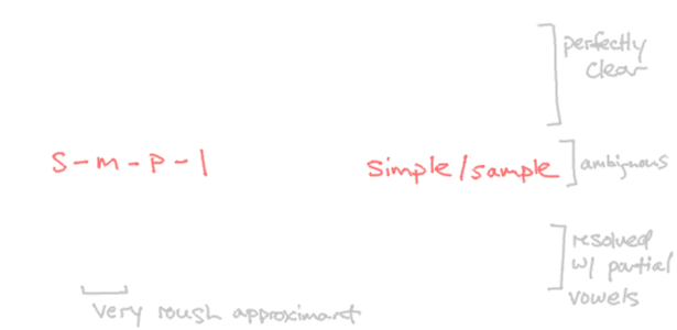
The reasoning for vowels as serifs is twofold. First, we've already reserved the simplest shapes that our strict geometric criteria will allow, so more complicated ones will stand out and upset the rhythm of words. Second, observing from Arabic and Hebrew, vowels aren't strictly necessary to identify a word. By disconnecting them from the normal letter sequence and demoting them to a joint, we allow but not require them:

K____R[SZ].Putting It All Together
...and that's it! I'll leave you with some more complicated examples:
